Wednesday, March 18, 2015

Design For Media: Rotoscope

Fresh off my lesson from the last project of over promising and under delivering I approached this project not having learned my lesson at all.  At first I was going to attempt to rotoscope this:


I got two frames into it over the course of 20 minutes and realized that something like this would take about a month to do.  So I scaled back to the simplest things I could think of and produced this instead:


Even then the project two TWO more days than I expected!  Doing the simplest things I could imagine!!!

I think the point could have been conveyed with 50 frames.  200 though?  Jesus Christ.

Design For Media: Perspective and Atmosphere

What was required:


What I tried to do instead (the pencils were too see so I had to add some filters to improve visibility of the lines):


I might have been able to get it done but the weekend of my cousin left for the army.  So I came nowhere near close to finishing it.  However, all the line work is done and I went over the piece with fixative and clear gesso.  So it's ready for any kind of medium I want to use as soon as I have time (Clearly it's not ready for Photoshop though...)

The lesson was learned though: I can't make every art project some kind of masterpiece ready for a portfolio.  I just have to do the simple things the teachers are asking for.

Saturday, March 7, 2015

Design For Media I: Atmosphere, High Key, and Low Key

The below scene if from the movie 'Book of Eli'.  The project asked for five things:

-A scene from a movie reduced to five values (upper left)

-That same scene rendered via specific line methods such as cross hatching, stipling, etc (lower left)

-An excerpt of the scene done in high key values (upper right)

-An excerpt of the scene done in low key values (lower right).

-For the excerpts to be done in paints to show we have a basic understanding of mixing paints.

This is the project I handed in:


Again this project is just busy work because either you get this concept and you can render it either digitally with little effort or manually with a lot of effort.  Sensing the tedium in this I asked my teacher the following, "You mind if I do a full rendition of the this picture via oils on canvas?"

This is the picture I asked replace the above tedium:


This picture has all the prerequisites.  High and low key areas, atmospheric perspective, and to do it well most DEFINITELY takes a good understanding of manipulating paints.  If you don't know how to mix paints you have no freaking prayer of even coming close to getting this done.

And this exemplifies the crux I've have with this design class.  I have a great and knowledgable teacher.  Interesting directions.  But absolutely nonsense limitations for those that want to reach higher.  I wanted to do something that could make people go, "Wow.  That's awesome."  Possibly even, "Are you willing to sell that?"

But instead it will be regulated to a spot in my storage bin.  :(

Design for Media I: Patterns

I don't know how to feel about this assignment.  It was fun to group with my partners and pose for the pictures.  It was also cool in concept that we are actively creating optical trickery but it just felt like a bunch of busy work.  

"Hey your vision gets shakey with some parallel black and white lines!"

"Yeah I get it."

"Hey this is how you make patterns in Illustrator."

"Cool.  Put it up on mommy's fridge."

I am grateful for the latter bit of knowledge; I simply didn't know that I could create patterns simply by dragging the 'base square' into the swatches window.  But to make an entire project out of that?  Come on man.....


Design for Media I: Multi Stage Figure to Ground Transition

Now I knew at the start my design wasn't going to really deliver a clear transition.  Even so my professor had us use sumi ink for this and I absolutely loved it.  I was more concerned with having reasons to really put huge angular swaths of this wonderful ink across the board than I did with the transition.  It doesn't really get the transition done in an obvious manner at all.  It's the process a kanji transforming into another kanji and back into itself.  The smaller circles at the stage radials are more or less 'mechanically accurate' transitions (thank you Adobe Illustrator step tool).

The background of each layer is actually a giant version of the kanji on it's outer edge twisted at a random angle.  Since the center of each stage is obscured by the inner stage that's the next closest to the center a lot of that information is obscured.

The funny thing is even though as class project it was far less than ideal I have nowhere near the amount of dismissing hatred for this as I would with one of the illustrations I normally do.  Odd.

The Adobe Illustrator step guide I created and used.  I should have done circular grounds instead of squares in the final piece.  :(
bristol, sumi ink

This is a good example where preference clashes with the task at hand.  I was really aiming for a somewhat centered, 'large print', transition.  Because each circle obscures the center of the circle behind it this results in a less than optimal transition effect.

I thought about drawing each kanji multiple times along the edge of its respective layer but 1. I didn't have enough time to do that.  2. It seemed tacky.

Design for Media I: Figure and Ground Transition

Bristol, Micron pen, Sharpie

It didn't turn out quite like I had hoped but I had fun doing it.  I decided halfway through the helix that I actually did want it to be bi symmetrical but by then the ink was laid down and it was too late sans a white out operation procedure.  The lower portion was going to be similar to the Toonami logo but I realized early on I just didn't have time for that type of complexity.

What I like about design projects like this is that they take me away from my neurotic inhibitions that are present when I do illustration.  Since I am still such a neophyte when it comes to raw design I have no choice to admit to myself, "Hey you're a beginner.  Just jump in and make art.  It has to be nothing else except the raw principles of expression."

Almost like what I think of art and my craft are just weights holding me down for when I tread into the realms of design... I don't absolutely hate what I produce and am not afraid to make mistakes.  Interesting.

Design For Media I: Basic Composition and Figure/Ground


The mission is thus: pick ten images; it doesn't matter what their source or medium is.  Then after they are selected break down each image's composition down into basic shapes.  Simple enough right?

It is but I gave my teacher such a hard time over this.  You wouldn't even believe it.  I'd say the biggest issue about this is this represents discarding an ignorant restriction.  See as far as influences go it's always been okay to dish out praise but to not let myself really be influenced by any one artist.

I always felt like I was ripping them off.

But my teacher remained adamant on me doing this so I had to finally dig into an artist's style that I admire and let their techniques and ideas saturate my way of thinking and inevitably let the chosen pieces influence my style.

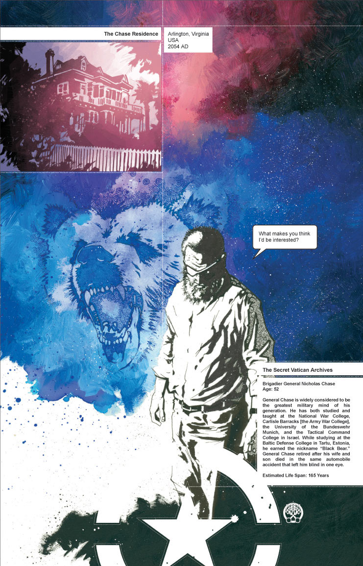
I chose Jonathan Hickman.  He seamlessly transverses the realms of illustration and design like no other.  Considering this is for a design class and I come from an illustration background it was an ideal target for the assignment.

It's worth noting that before I really analyze Mr. Hickman's style the only impression I have of it is that it's beautiful, it uses color wonderfully, and it's elegant but I'm really sure (letting myself) see what's really going on.  Let's see what I think after the studies!

.


Ten pieces later what do I think of Mr. Hickman's style?  It's still a sight to behold and he is light years ahead of me, however, it's not so much an alien work work of beauty as it once was... just a regular ol' work of beauty.  

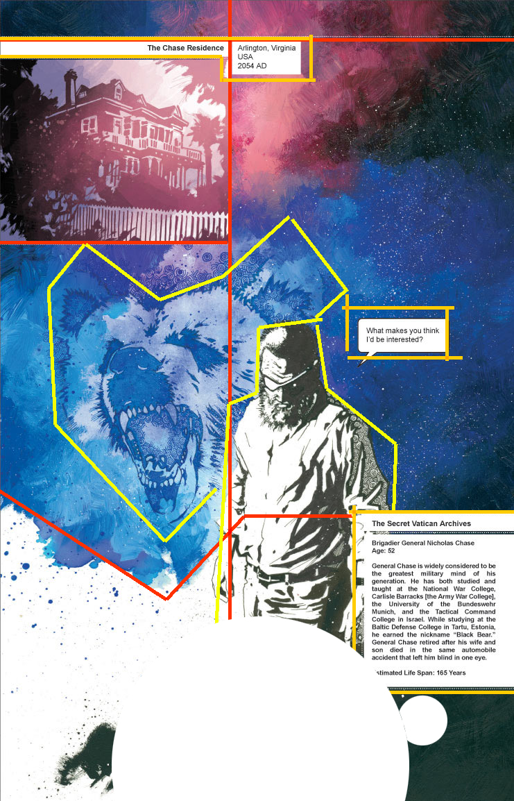
Firstly it seems likely that Mr. Hickman employs a grid system of some sort.  Whether it's the golden ratio, rule of thirds, etc. I can feel some sort of grid like order permeating all his works.  It makes perfect sense too.  How else would he have such a seamless transition between design and illustration elements?  They are all aligned on the same grid.

This also allows the text elements to exist side by side to the other design and illustration elements.  The grid just snaps everything into place.

It does seem safe to say that the grid system he uses fluctuates with his mood as there is no pattern to it.  Although there doesn't seem to be many subdivisions in the center of a given piece.

Once the grid is laid out he picks just few places among the grid to insert the illustrative pieces and then let's his graphic design skills bleed the elements into one another. 

What was interesting about this assignment is that it asked us to break given images down into basic shapes but Mr. Hickman's work is already largely broken down into these shapes as that's his style. That leads me to conclude that Hickman lead's with strong design elements and then supports it with illustration and not the other way around.

What I really would have liked for this assignment is for us to try to codify a given artist's style (like I attempted above) and then produce a piece of work based on the rules and guidelines we extract and see how close we come to emulation.  

Oh well.

Wednesday, February 11, 2015

Gabriel, The First Glitched Asura

Gabriel, The First Glitched Asura.  Pencils
I originally drew this as a birthday present for my good friend.  We ended up making an entire fictional universe involving mechanical angels based on this one sketch.

Angel Sidhe


Angel Sidhe.  I suppose this is kind of that faint hope we keep alive for the ones we love and the ones we lost.  What keeps us going when we want to give up and reality keeps telling us it just should never be.

Burnt City

Burnt City.  Bryce 4.x

Concept art for an unpublished story I made with a 3d modeling program called Bryce.  In comparison to Maya it was an absolute BREEZE to use.  I actually may go back to using it someday or at least check to see what has become of it.