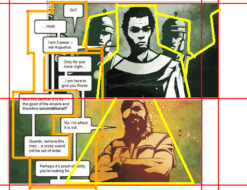
The mission is thus: pick ten images; it doesn't matter what their source or medium is. Then after they are selected break down each image's composition down into basic shapes. Simple enough right?
It is but I gave my teacher such a hard time over this. You wouldn't even believe it. I'd say the biggest issue about this is this represents discarding an ignorant restriction. See as far as influences go it's always been okay to dish out praise but to not let myself really be influenced by any one artist.
I always felt like I was ripping them off.
But my teacher remained adamant on me doing this so I had to finally dig into an artist's style that I admire and let their techniques and ideas saturate my way of thinking and inevitably let the chosen pieces influence my style.
I chose Jonathan Hickman. He seamlessly transverses the realms of illustration and design like no other. Considering this is for a design class and I come from an illustration background it was an ideal target for the assignment.
It's worth noting that before I really analyze Mr. Hickman's style the only impression I have of it is that it's beautiful, it uses color wonderfully, and it's elegant but I'm really sure (letting myself) see what's really going on. Let's see what I think after the studies!
Ten pieces later what do I think of Mr. Hickman's style? It's still a sight to behold and he is light years ahead of me, however, it's not so much an alien work work of beauty as it once was... just a regular ol' work of beauty.
Firstly it seems likely that Mr. Hickman employs a grid system of some sort. Whether it's the golden ratio, rule of thirds, etc. I can feel some sort of grid like order permeating all his works. It makes perfect sense too. How else would he have such a seamless transition between design and illustration elements? They are all aligned on the same grid.
This also allows the text elements to exist side by side to the other design and illustration elements. The grid just snaps everything into place.
It does seem safe to say that the grid system he uses fluctuates with his mood as there is no pattern to it. Although there doesn't seem to be many subdivisions in the center of a given piece.
Once the grid is laid out he picks just few places among the grid to insert the illustrative pieces and then let's his graphic design skills bleed the elements into one another.
What was interesting about this assignment is that it asked us to break given images down into basic shapes but Mr. Hickman's work is already largely broken down into these shapes as that's his style. That leads me to conclude that Hickman lead's with strong design elements and then supports it with illustration and not the other way around.
What I really would have liked for this assignment is for us to try to codify a given artist's style (like I attempted above) and then produce a piece of work based on the rules and guidelines we extract and see how close we come to emulation.
Oh well.
![[Lie-Heim Shee]](https://blogger.googleusercontent.com/img/b/R29vZ2xl/AVvXsEhI8I16fr21RoLaeN60O3Ql2oOliBvaMMjDubDqTM6CiBDqnr5u3JCydz74B-Esysnzt5ZJrromI5WIS1uIV0Fm8Ht9BnXSQLrprLAThdUWRQfkicLmeOfgBkjO9My2k63gFJ_7xd3RgO8R/s1600/lihimsidhe_neo_banner.png)


No comments:
Post a Comment